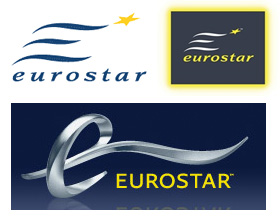
Eurostar rebrands - suppose I'll get used to it

So my favourite rail service - Eurostar - is being rebranded. The old E* logo, in use from the start of the service in the mid-1990s, is to be replaced with a silver 3D logo, dark blue background and a yellow caps sans serif font.
There is also an adaption of the font to be used across Eurostar's publicity material, with long tails on letters - more on this from Logobird here.
The logo reminds me a bit of the TGV logo (humour about that logo here). I'm also surprised that blue seems to be back, as the new Eurostar e320 train used dark grey and yellow instead.
The new logo is going to be used most often printed flat - on signs, on the side of trains - and not in 3D environments. As a result I'm broadly unimpressed, although I suppose I'll get used to it.